
Let’s say it straight:
Most brands aren’t boring. They’re just too scared to show who they really are.
They play it safe. Blend in. Follow trends. They water themselves down to avoid offending, alienating, or — God forbid — standing out.
It’s not that they lack personality. It’s that they’ve built walls around it.
Packaging is the loudest expression of a brand in the wild. And right now? Too many brands are whispering when they could be singing.
Let’s talk about why this happens — and how to fix it.
Playing It Safe Feels… Safe. But It’s Not.
You know what doesn’t win customers anymore?
- That same millennial-matte, sand-and-sage palette we’ve seen on a thousand skincare startups, similar to all the “small batch” coffee beans in professional but same-same foil coffee bags.
- Sans-serif logos that all say “gentle, approachable, direct-to-consumer” but say nothing specific
- Copy that starts with “Our mission is…” and ends with no emotion
These brands aren’t failing because they’re bad. They’re failing because they’re forgettable.
They fear being “too much.” But here’s the thing: being too much is often what makes a brand mean something to the right person.
Safe might get you a polite nod. But brave gets you a yes. A click. A cart. A customer.
Most “Muted” Brands Aren’t Minimalist — They’re Hiding
Minimalism is a design choice. Muted identity is often a fear response.
You know the difference:
- A minimalist brand: bold in its restraint, decisive in its whitespace, sharp in its point of view.
- A muted brand: vague, shapeless, and anxious not to disrupt anything or anyone.
If your packaging looks like a mood board from five years ago… it’s not timeless. It’s just afraid.
If your copy avoids bold claims or strong opinions… you’re not being transparent. You’re being invisible.
A brand that hides is a brand that doesn’t get chosen.
You Have a Voice — You’re Just Not Using It
Scroll through your brand assets right now — logo, packaging, website, label, box insert.
Ask yourself:
- Would your people recognize you in a lineup?
- Is your tone memorable, or could it belong to anyone?
- Does your color palette whisper “pleasant,” or shout “this is us”?
Here’s the tough love: if everything looks fine, it’s probably not working.
The brands we remember — the ones we photograph, gift, re-buy — are the ones that own their weirdness, their warmth, their wow.
They sound like someone.
They look like somewhere.
They feel like something.
And they don’t apologize for it.
The Packaging Details That Scream (In the Best Way)
If you want to stop hiding, start small — but make it loud in the right places.
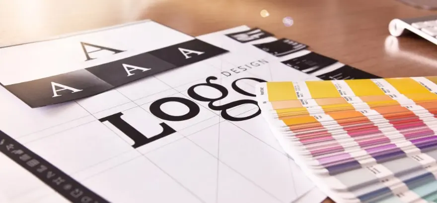
1. Custom Labels That Hit Different
The right label does more than inform — it invites.
- Metallic foil in an unexpected color on custom tea tins? That says “daring.”
- Oversized typography wrapping around the small spice jar? That says “confident.”
- A label shaped like a leaf instead of a rectangle on a custom cannabis bag? That says “we’re not like the others.”
The details are the signal. They say what you’re too shy to type in all caps.
2. Tissue Paper That Delivers Drama
Custom tissue isn’t an “extra.” It’s a stage.
- Vivid prints. Loud phrases. Unexpected patterns.
- Tissue that makes someone pause before they even see the product.
- Wrapping that feels like ceremony — because this product is the main event.
Let your packaging have a moment. You’re not boring — your box just isn’t letting you speak.
Pop Culture Doesn’t Play Safe. Why Should You?
Imagine if Rihanna’s Fenty Beauty launched with a beige box and soft script.
If Oatly stuck to a dairy-style blue and white palette.
If Glossier never added that punchy pink pouch.
If Liquid Death looked like a yoga water brand.
They would’ve disappeared.
Instead, they showed up fully formed, fully unapologetic. And the right people saw them, heard them, and followed them.
Pop culture knows that bold doesn’t repel — it attracts.
Same with your brand. The more “you” it becomes, the more your people can actually find it.
What Happens When You Finally Show Up?
You stop sounding like an echo and start sounding like a voice.
You stop apologizing and start resonating.
You give your product the stage it deserves — and your customer the moment they didn’t know they were waiting for.
Because the truth is:
- You don’t need to be louder.
- You need to be clearer.
- You don’t need more features.
- You need more feeling.
And the fastest, most powerful place to show it?
Right there on the package.
Final Thought: Let Your Brand Be Seen — Fully, Loudly, Honestly
Boring isn’t your problem. Fear is.
Let your labels get bolder. Let your boxes tell stories. Let your colors sing.
And let the people who’ve been searching for you — the real you — finally recognize you when they see you on the shelf.
Because if you never show up boldly, you never get chosen wholeheartedly.


Leave a Reply