

Post Preview
Key Takeaways
- Give each mobile screen one clear purpose and guide users toward the next step.
- Use visual hierarchy, spacing, and grouping to make important information easy to find.
- Keep navigation simple, predictable, and supported by visible controls.
- Design common flows such as onboarding, forms, payments, and content discovery around user needs.
- Make layouts adaptable across screen sizes, orientations, devices, and input methods.
- Build privacy, accessibility, readability, and clear feedback into the interface from the start.
- Test important tasks with real users and fix the biggest sources of confusion before release.
Great mobile screens help people complete a task without making them stop to decode the interface. Whether someone is checking out, booking an appointment, reviewing a message, or updating account details, the screen should make the next step clear. Reviewing strong mobile app UI design examples can help spot familiar patterns, but every layout still needs to serve the product’s specific task and audience.
Visual polish matters, but it cannot repair a confusing flow. People notice structure first: what the screen is for, what information matters, what they can tap, and what will happen next. Designing around those questions creates screens that feel faster, more trustworthy, and easier to learn.
Why Screen Structure Matters
Each screen should have one primary job. A checkout screen, for example, should guide people through delivery and payment details, and to final confirmation, in a logical order. When several unrelated goals compete for attention, users hesitate, make errors, or leave before finishing.
Start by organizing information according to the user’s decision-making process, not the company’s internal structure. Put essential details before irreversible actions, show costs before purchase confirmation, and make important changes easy to review.
Start With User Goals
Before selecting colors, typefaces, icons, or components, write the user’s goal in one sentence. For example: “I want to reschedule my appointment for next week.” That sentence helps distinguish the primary action from supporting choices, such as selecting a provider or adding a note.
- Write the goal in plain language.
- List every step required to complete it.
- Remove steps that do not create value.
- Mark’s decisions need explanation or reassurance.
- Sketch the shortest useful screen sequence.
Build A Clear Visual Hierarchy
Size, contrast, spacing, alignment, and position tell users where to look first. A meaningful heading, a clear primary action, and a small number of grouped details usually work better than a dense page where every element looks equally important.
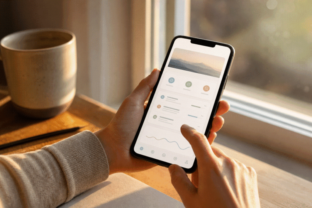
Keep headings short, use supporting text only when it answers a likely question, and divide related content into scannable sections. Cards can help separate distinct items; lists work well for repeated choices; tabs suit closely related views; and bottom sheets are useful for temporary actions that should not interrupt the main task.
A Quick Hierarchy Test
- Can someone explain the screen’s purpose within three seconds?
- Can they identify the main action without reading every label?
- Can they tell which elements are interactive?
- Can they see the result after taking an action?
Choose Navigation Carefully
Navigation should match the number and type of destinations people visit most often. Bottom navigation is effective for a small set of high-priority sections. Stacked pages work for focused, step-by-step tasks. Contextual menus are better for occasional actions, not core features that users need to find quickly.
Do not make gestures the only way to complete an important action. Provide visible controls, predictable back behavior, and clear location cues so users can recover when they enter the wrong area. Deep navigation can hide value, especially when users must open several menus just to reach a routine task.
Design Common User Flows
Onboarding And Account Setup
Ask for only the information needed to get started. Explain why a permission is useful before requesting it, let people skip optional setup, and show progress when multiple stages are required. A shorter first session is often more valuable than immediately collecting every possible preference.
Forms And Data Entry
Use the right keyboard for each field, keep labels visible while people type, and place errors beside the field that needs attention. Preserve entered information after validation fails. Helpful form design prevents frustration before it becomes abandonment.
Commerce And Payments
Show prices, fees, delivery timing, and key conditions before the final action. Replace vague labels like “Continue” with more specific ones, such as “Place Order.” Build clear states for success, payment failure, cancellation, refunds, and retries due to temporary issues.
Content And Discovery
Make search, filters, sorting, and saved items easy to locate. Content previews should provide enough context to support a choice without forcing users to open every result. Empty states should explain what happened and offer a useful next step.
Support Different Devices And Screen Sizes
A screen designed only for one phone width will eventually break. Plan for portrait and landscape use, larger text, split-screen windows, tablets, foldables, and desktop-style layouts. Android’s guidance for adaptive apps across changing window sizes is a useful reminder that responsive design is more than stretching the same layout.
Use flexible containers rather than fixed coordinates. On a narrow screen, show one focused pane. On a wider display, consider a list-and-detail arrangement that lets people compare information without constant back-and-forth navigation. Also support keyboards, pointers, and other inputs where larger devices make them likely.
Make Privacy Visible
Privacy and security should appear in the flow, not be buried in settings. Explain permissions in plain language, separate sensitive actions from casual actions, and ask for confirmation before a person shares personal data, deletes an account, or makes a lasting change.
Consider what is visible in public places. Notifications, account balances, health details, and verification codes may need discreet previews, masking, or an extra confirmation step before exposure.
Improve Accessibility And Readability
Accessible design improves the experience for everyone. Use readable text, strong contrast, clear control labels, and touch targets with enough space around them. Never rely on color alone to communicate an error, status, or selection. The accessibility success criteria for readable, operable interfaces can help teams check common gaps before release.
Test larger text settings, dark mode, screen readers, reduced motion preferences, and keyboard navigation. Content should reflow gracefully instead of clipping important information or hiding actions off-screen.
Test With Real Tasks
Test screens with three to five tasks that matter most. Give those tasks to people who have not seen the design, then watch where they pause, tap the wrong item, ask for help, or lose confidence. Record completion, errors, time, and comments, then fix the biggest source of confusion first.
Questions To Ask During Testing
- What do you think this screen is for?
- What would you tap first?
- What do you expect to happen next?
- Which detail feels unclear or missing?
- What would make you stop using this flow?
Conclusion
The best mobile screens do not demand attention for their own sake. They reduce effort, explain choices, and help people move forward with confidence. Clear structure, purposeful navigation, useful feedback, adaptable layouts, and inclusive controls create an experience that feels natural long after visual trends change.
 Admin
Admin